Pantone Matching System in Printing
The Pantone Matching System (PMS) ensures accurate and consistent color reproduction across different materials and locations. It assigns unique alphanumeric codes to colors, making it a universal standard for brands and printers worldwide. PMS is critical for maintaining brand identity, reducing color errors, and offering a broader color range than traditional CMYK printing.
Key points about PMS:
- Exact Color Reproduction : Pre-mixed inks ensure precise matching.
- Global Consistency : Works across materials like paper, fabric, and plastic.
- Wider Color Options : Includes metallics, fluorescents, and specialty shades.
- Use Cases : Ideal for logos, corporate branding, and custom printing projects.
Quick Comparison: PMS vs. CMYK
| Aspect | Pantone Matching System (PMS) | CMYK Printing |
|---|---|---|
| Color Accuracy | Very reliable | Can vary between runs |
| Range | Over 1,867 spot colors | Limited to 4-color process |
| Best Use | Logos, branding materials | Photography, gradients |
| Cost Efficiency | Better for large volumes | Affordable for small runs |
PMS is the go-to choice when exact color consistency is essential, while CMYK is better suited for detailed, full-color designs. Keep reading to learn how PMS works and why it’s a cornerstone of professional printing.
CMYK vs Pantone vs RGB – What’s the difference?
How the Pantone Matching System Works
The Pantone Matching System (PMS) provides a structured way to identify and reproduce colors with accuracy and consistency.
Understanding PMS Codes
Every Pantone color is labeled with a unique alphanumeric code (e.g., PMS 300 C). The number indicates the color, while the letter specifies the type of paper – C for coated [3] . This universal system allows designers, manufacturers, and printers to communicate color choices without confusion.
With a library of over 1,000 colors, including metallic and fluorescent options [1] , the system ensures precision. Tools like light boxes are often used to check colors under consistent lighting conditions.
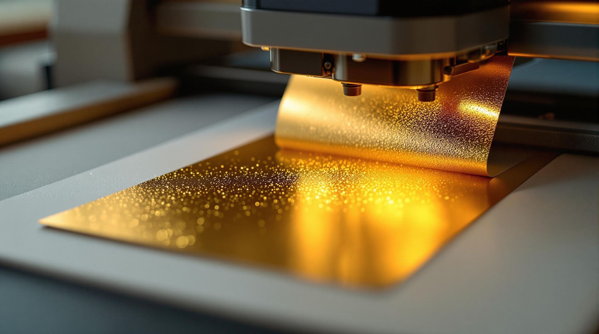
How Pantone Colors Are Reproduced in Print
Printing Pantone colors relies on exact ink formulas provided by Pantone [3] . This precision is critical for professional print shops, such as Miro Printing & Graphics Inc., to meet specific client requirements.
The process involves two key steps:
- Choosing the correct PMS code and mixing inks according to Pantone’s detailed formulas.
- Checking the printed colors under controlled lighting to confirm accuracy.
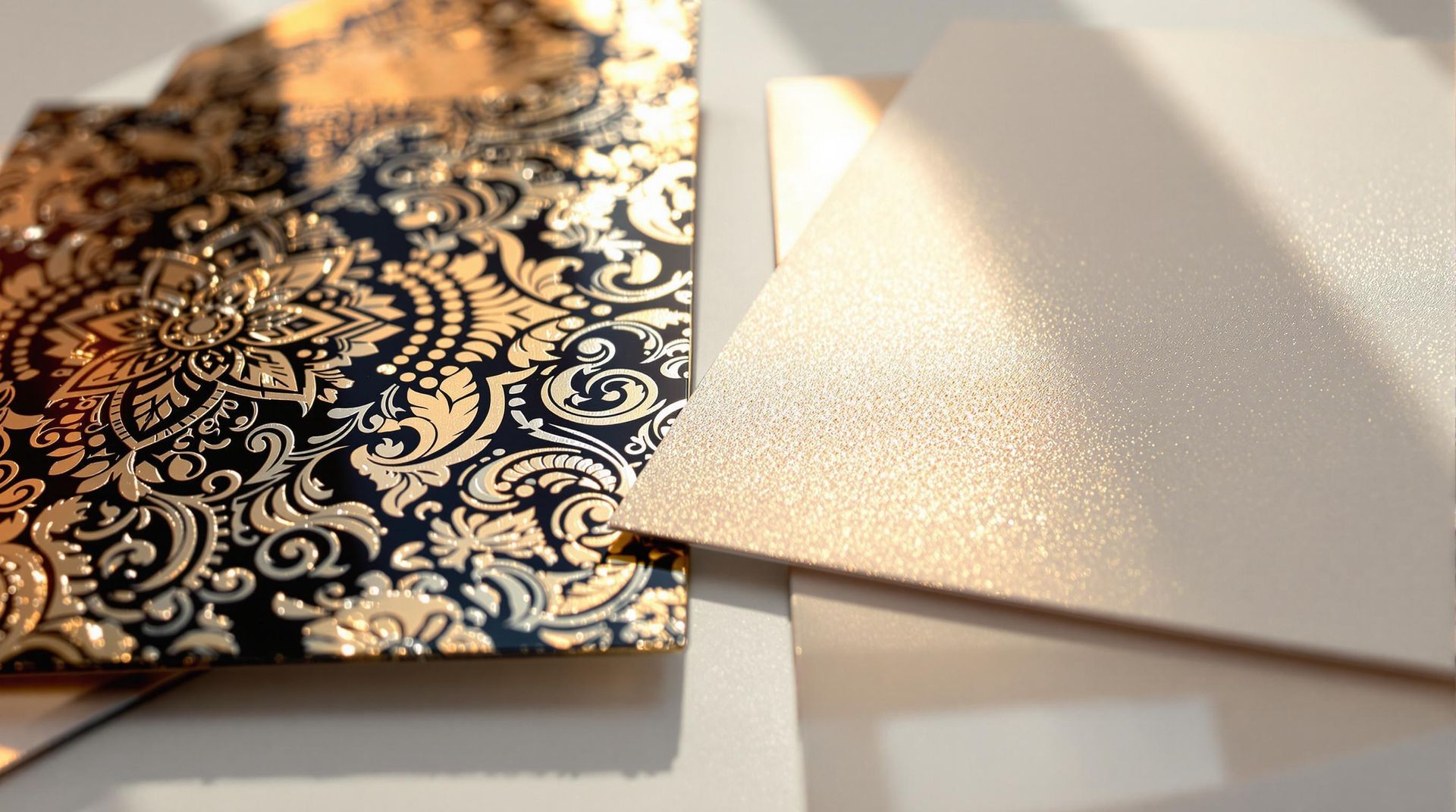
Achieving Consistency Across Different Materials
PMS ensures uniform color reproduction across a variety of materials [3] . Specialized color palettes are designed for specific substrates, as shown below:
| Material Type | Pantone Palette |
|---|---|
| Paper | Solid Color |
| Fabric | Textile |
| Plastic | Plastic |
These palettes are tailored to their respective materials, ensuring that a brand’s colors remain consistent no matter where they’re applied [5] . This system is essential for maintaining brand identity across diverse projects and materials.
Advantages of Using the Pantone Matching System
The Pantone Matching System (PMS) offers a range of benefits that make it a go-to tool in the printing industry. Here’s why PMS stands out for color management.
Ensuring Brand Uniformity
PMS provides a universal color standard that keeps brand colors consistent across all materials [3] [5] . For example, when companies like Miro Printing & Graphics Inc. handle multiple projects for a client, PMS ensures that the same brand colors appear on everything – whether it’s business cards, banners, or packaging.
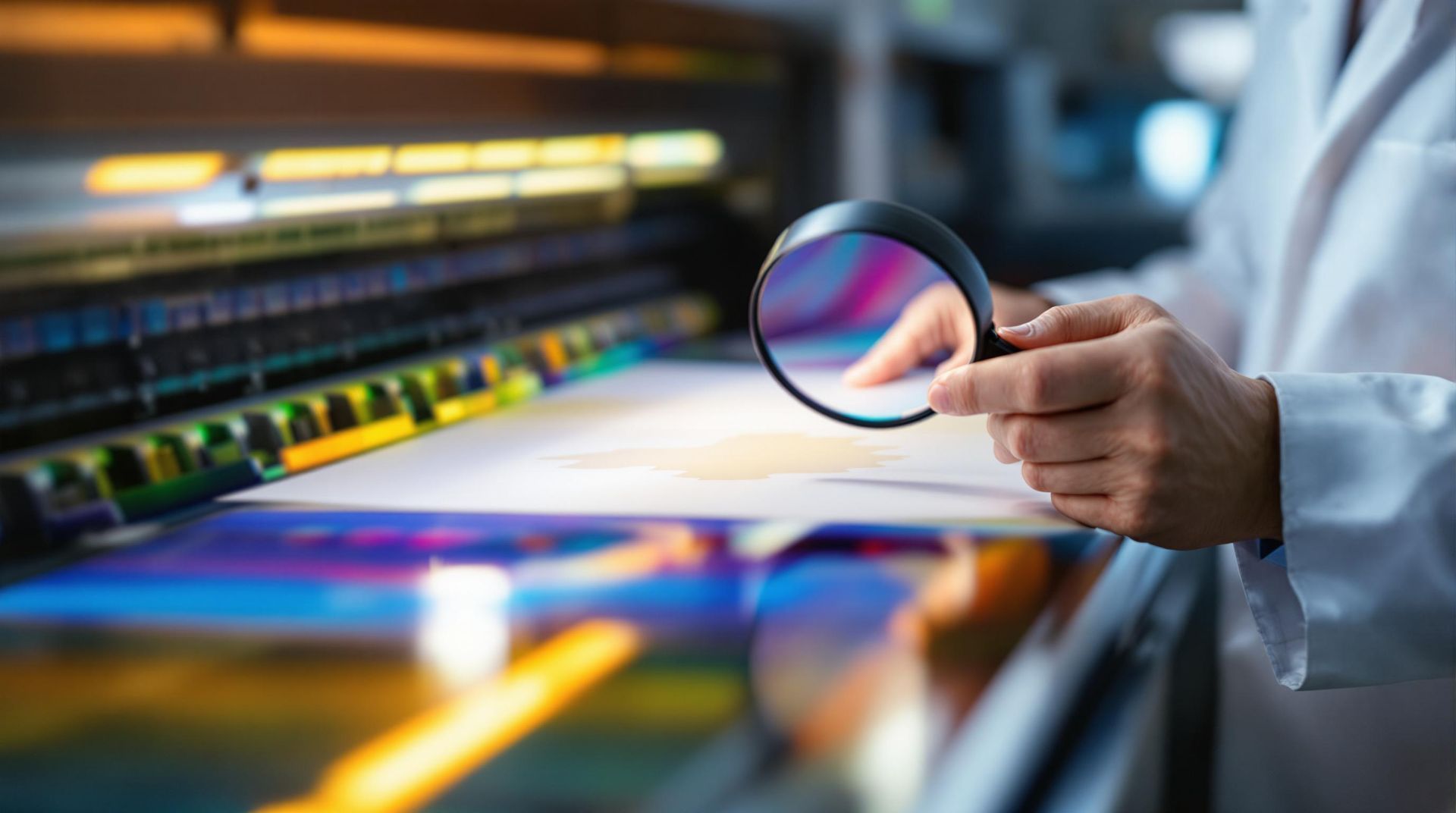
Achieving Precise Color Reproduction
PMS reduces mismatches between design concepts and final prints by using a standardized system [4] [7] . The system relies on specific ink formulas, controlled quality checks, and detailed material guidelines to deliver consistent results.
| Feature | Advantage |
|---|---|
| Color Matching | Exact formulas for consistent reproduction |
| Quality Control | Verified under controlled lighting |
| Material Specifics | Tailored instructions for different surfaces |
This level of precision helps avoid expensive reprints and ensures client satisfaction, especially when working with corporate materials where accuracy is crucial.
Offering a Broader Color Range
PMS goes beyond the limitations of traditional CMYK printing by providing a wider selection of colors [3] [5] . This includes:
- Specialty Shades : Colors that standard printing can’t achieve
- Metallic Effects : Adds a premium look to materials
- Custom Colors : Reproduces brand-specific shades with consistency
These features make PMS a vital tool for professional printing, offering capabilities that CMYK systems simply can’t match.
sbb-itb-ce53437
Comparing Pantone Matching System and CMYK Printing
Color Accuracy and Brightness
PMS and CMYK handle color reproduction in very different ways. CMYK relies on four inks – cyan, magenta, yellow, and black – to create a wide range of colors, while PMS uses pre-mixed inks for exact shades [1] [9] . This makes PMS a go-to choice for businesses that need precise color consistency, especially for corporate branding.
One key difference is consistency. CMYK can show variations across print runs, with a typical color shift of 5-10% between screen and print [10] . On the other hand, PMS delivers uniform results thanks to its standardized mixing methods, offering over 1,867 spot colors [2] .
"Pantone is all about precision. The universally used system mixes ink to create a consistent and exact color match every time." – NoIssue Blog [10]
Cost and Efficiency Comparison
Choosing between PMS and CMYK often comes down to the project’s requirements and budget. Print shops like Miro Printing & Graphics Inc. suggest PMS for materials where exact color matching is critical, such as logos and corporate branding. CMYK, however, is often the better option for designs with intricate gradients or photographic elements, as it tends to be more cost-effective [9] .
| Aspect | Pantone Matching System | CMYK Printing |
|---|---|---|
| Production Speed | Faster for single-color jobs | Better for full-color projects |
| Color Consistency | Very reliable across materials | Can vary between runs |
| Best Use | Logos, branding materials | Photography, detailed designs |
| Cost Efficiency | Ideal for large-volume runs | More affordable for small batches |
PMS is ideal for projects where exact color accuracy is non-negotiable, while CMYK shines in designs with complex visuals. However, CMYK may require extra quality checks to ensure the final product meets expectations [2] [11] . Knowing these differences allows businesses to pick the method that aligns best with their goals, whether it’s for branding or custom prints.
Applications of the Pantone Matching System
PMS in Custom Printing Services
Print shops use the Pantone Matching System (PMS) to achieve precise color consistency across a wide range of printing projects. For example, companies like Miro Printing & Graphics Inc. rely on PMS to ensure that brand colors remain uniform across items like business cards, brochures, banners, and packaging – no matter the material or scale.
PMS’s standardized ink formulas allow for the creation of over 1,867 colors, ensuring exact matches for custom printing needs [2] . This level of accuracy is essential for corporate materials where maintaining brand consistency is critical.
Additionally, PMS supports global branding efforts by enabling consistent color communication across different markets, making it a key tool for companies with an international presence.
PMS in Branding and Design
PMS acts as a universal color language for designers and printers, ensuring brand colors remain consistent worldwide. Its standardized codes eliminate confusion, allowing brands to maintain recognition across all forms of marketing materials.
PMS is also widely used in industries like fashion, textiles, plastics, and paint manufacturing [8] . Designers often turn to PMS for colors – such as metallics and fluorescents – that cannot be reproduced using CMYK.
Conclusion
The Pantone Matching System (PMS) plays a key role in professional printing and branding, offering unmatched precision and consistency.
With a library of 2,161 solid colors created from 14 base inks, PMS ensures accurate color reproduction. Its unique codes for coated, matte, and uncoated paper stocks guarantee consistent results across different surfaces [6] .
One of PMS’s standout features is its ability to create specialty colors like metallics and fluorescents – options that go beyond what CMYK printing can achieve [5] [12] . This expanded palette allows designers and print shops to meet complex printing demands while maintaining precise color matching.
Thanks to its global standardization, PMS has become a trusted tool for ensuring brand consistency across the world. Businesses and print shops, including Miro Printing & Graphics Inc., rely on PMS for dependable results on a variety of materials.
For the best results, experts suggest using a light box to compare printed materials with Pantone swatches under consistent lighting conditions [6] . This attention to detail solidifies PMS’s reputation as the leading choice in professional printing.
Related posts